I gave yesterday an introductory workshop on coding within the Digital Day of Ideas organised by Digital Scholarship here at the University of Edinburgh. I thought this could be interesting for a wider audience so I published it online. It is designed to present the basic concepts of any programming language in roughly 2 hours to an audience of the Social Sciences and Humanities that never ever coded before.
This is the list of topics covered by the tutorial:
understand the basic concepts of a programming language
repeat tasks with loops
structure your code with functions
add some logic to your code
open text files
plot stuff
The tutorial has 2 blocks; in the first one you will see the basic ideas and in the second one you will apply them in a specific task: identify the most frequent words used in a book.
The tutorial and the dataset can be downloaded from github or if you prefer as a zip file. You will need a development environment where to type and execute the source code, so you can use the spyder IDE within Anaconda:
Almost all statistical tests that archaeologists and historians use are based on the concept of Null Hypothesis Significance Testing or NHST. If someone told you that you should be using some stats in this paper this is probably what they mean for it. The comment is usually accompanied by a reference to a thick statistics manual where you repeatedly find a concept called p-value and other obscure terms.
A good understanding of p-values and NHST is essential for the current scientist; otherwise you won’t understand the results of a large percentage of papers you should be reading. The approach itself is rather simple, but current teaching of statistics bury it into a myriad of complex tests that you are supposed to learn in an almost ritualistic way, thus making everything more complicated than it really is (T-test, Chi-square test, Kruskal-Wallis test…seriously, who chooses these names??).
Let’s take a step back and see what NHST is really about.
the concept of the null hypothesis
Imagine that you manage a lab and you need to test if a newly developed antibiotic drug kills bacteria. The trial seems straightforward: you put some of the new drug into a Petri dish with the bacteria and you wait to see if it works (also, apologies for my ignorance on lab trials to any lab technician that could be listening…). Your working hypothesis is that the drug is effective and kills bacteria, so what are the possible outcomes?
it works! bacteria are dead and the new drug is effective
it doesn’t work and bacteria are still alive.
In the first case we would accept the working hypothesis while in the second one we would reject it. However, it is not as simple as it seems because you could have lots of grey results between the 2 extremes: some bacteria may still be alive, bacteria could be dying for different causes than the drug, or even by pure chance.
Someone came up with a simpler approach to this problem that can be summed up as follows: what are the chances that you get the same result by pure chance? If these chances (known as the p-value of the test) are low enough then we could reject the idea of pure chance, thus confirming that in the trial something was killing bacteria. This is NHST: if we can reject the null hypothesis of pure chance with a good degree of significance then the alternate hypothesis of something going on is selected as a better explanation of the evidence.
This degree of significance is in reality defined as a threshold for the p-value; if the chances are typically lower than 5% (p-value < 0.05) then we will reject the null hypothesis.
when to apply and when not to apply NHST
This is the type of scenarios where NHST was originally developed because in a controlled environment you can only design experiments with 2 results (it works or it doesn't work). However, this binary outcome is not necessarily found in other disciplines and specially it is problematic in archaeology.
Imagine that you are studying settlement patterns in late prehistoric Europe and you want to identify the geographical properties of these settlements. You would test if the gradient of terrain or slope is relevant here by testing the null hypothesis that it is not relevant.
Would you?
Really? If you think about it this null hypothesis is meaningless because we know that you won't be living at a slope of 40 degrees and hanging from a rope. You will obviously reject the null hypothesis! Moreover, this result doesn't mean that slope was particularly relevant during late prehistory because slope is always relevant to human settlements for obvious functional reasons: we don't have wings to fly.
The choice of a meaningless null hypothesis is a classic example of bad statistics; you should always evaluate if the approach you are applying makes sense or you need to tackle the research question with a different method.
What you could certainly do is to assess if the geographical features exhibited by settlements changed over time. Let's see how NHST works in practice.
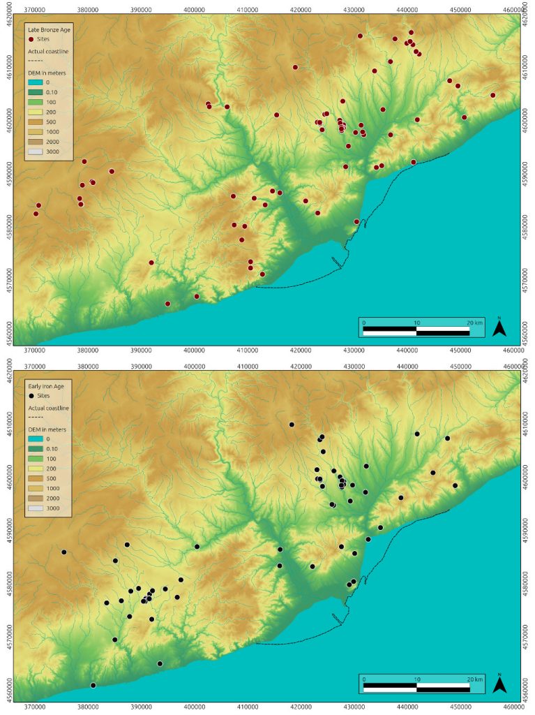
late prehistory in the NE Iberian Peninsula
The transition from Late Bronze Age (LBA) to Early Iron Age (EIA) in current Catalonia has been extensively studied during the last decades because of its interesting dynamics. Population seemed to shift from high-elevation pastures towards low-level agricultural regions; at the same time you find an increasing amount of artefacts brought to this area though long-range trade. Both processes seemed to increase the level of regional connectivity so…can we test this?
load the dataset
We will use here a dataset collected by Maria Yubero-Gómez who studied the period for her PhD and was published in:
* Yubero-Gómez, M., Rubio-Campillo, X., López-Cachero, F.J. and Esteve-Gràcia, X., 2015. Mapping changes in late prehistoric landscapes: a case study in the Northeastern Iberian Peninsula. Journal of Anthropological Archaeology, 40, pp.123-134. https://doi.org/10.1016/j.jaa.2015.07.002
distance to the closest natural route (i.e. main routes you would take to cross the region)
slope of the site in degrees
height in meters
period of the site (LBA or EIA; if a site was active during both periods it will have 2 entries)
perform Exploratory Data Analysis
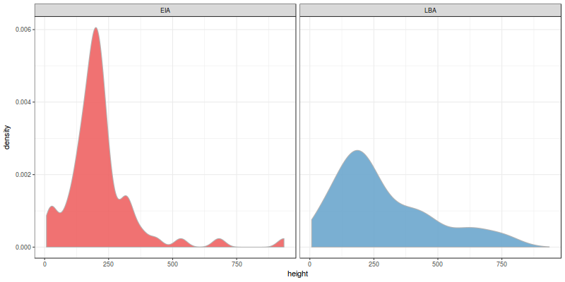
Let’s first focus on height. The first thing you need to do in any quantitative analysis is to explore the dataset with some plots:
[generic linenumbers=”False”]
library(ggplot2)
ggplot(sites, aes(x=height)) + geom_density(col=”grey70″, aes(fill=period, group=period), alpha=0.9) + facet_wrap(~period) + scale_fill_manual(values=c(“indianred2”, “skyblue3″)) + theme_bw() + theme(legend.position=”none”)
[/generic]
Empirical density estimates of height (m.) per period
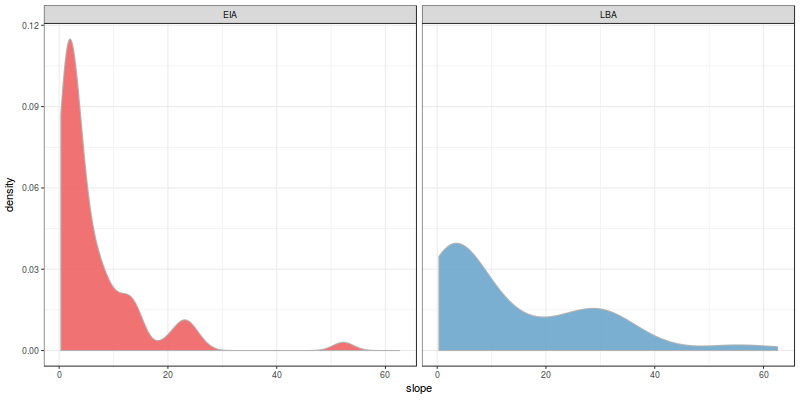
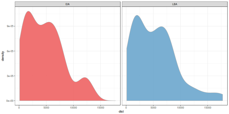
These are the density estimates for the evidence we collected. The distribution looks different for both periods, don’t they? Let’s take a look at the other 2 variables (slope and distance to natural routes):
[generic linenumbers=”False”]
ggplot(sites, aes(x=slope)) + geom_density(col=”grey70″, aes(fill=period, group=period), alpha=0.9) + facet_wrap(~period) + scale_fill_manual(values=c(“indianred2”, “skyblue3″)) + theme_bw() + theme(legend.position=”none”)
[/generic]
Empirical density estimates of slope (degrees) per period
and the last one:
[generic linenumbers=”False”]
ggplot(sites, aes(x=dist)) + geom_density(col=”grey70″, aes(fill=period, group=period), alpha=0.9) + facet_wrap(~period) + scale_fill_manual(values=c(“indianred2”, “skyblue3″)) + theme_bw() + theme(legend.position=”none”)
[/generic]
Empirical density estimates of distance to natural route (m,) per period
They don’t look as different as the slope. Specifically, the distribution of distances seems almost identical! However, the human eye is too good at identifying patterns so we may be finding similarities where there are not; we need to statistically test if they are different.
test the null hypothesis
Our null hypothesis can be defined as follows: the distribution of slopes is the same for both periods. If we cannot reject this null hypothesis then it means that the differences we see in the plots are caused by pure chance; on the other hand, if we can reject it then we can say that there was a change on the relevance of slope over the transition LBA-EIA.
The perfect test to evaluate this null hypothesis is known as Kolmogorov-Smirnov test. The input of the test are the 2 distributions and the output is the probability that they were created by the same process. To summarize:
If p-value > 0.05 then it means that there was a change between the 2 periods
If p-value < 0.05 then it means that there was no significant change from LBA to EIA.
Let's create 2 new data frames (one for each period) and apply the Kolmogorov-Smirnov test to the 3 variables:
The results for slope should be something like:
[generic linenumbers="False"]
Two-sample Kolmogorov-Smirnov test
data: eiaSites$slope and lbaSites$slope
D = 0.27647, p-value = 0.006207
alternative hypothesis: two-sided
[/generic]
Ignore the warning as it is not relevant right now. The p-value you see is extremely low so we can safely reject the null hypothesis that the distribution of slope does not vary over the transition. Nice! The same can be said for elevation as the value is also low; however, the p-value of distances is really, really (really) high. The chances are over 90% so we cannot reject in this case the null hypothesis that the typical distance to natural route changed from LBA to EIA.
final remarks
Some last comments on this analysis:
Attention! A low p-value does not mean that the difference between distributions is large. You can have a very significant yet small difference between distributions and it would give you a very low p-value (e.g. all sites at an elevation of 200m against all sites at an elevation of 220m.).
The choice of 0.05 as the significance threshold is a convention. Yes, we could choose 0.041 or 0.1 but you will see 0.05 as the limit in 90% of papers (also, if you see a paper using 0.1…don't trust the results…seriously)
there are like 2023 statistical tests besides K-S for any type of variable: categorical, discrete, multivariate…in any case I think KS is one of the most useful for archaeologists
The approaches based on Null-Hypothesis Significance Testing have a lot of issues and there is a current debate on science about the appropriateness of the method. Alternatives such as Bayesian inference and model selection are becoming increasingly popular. However, NHST is still the standard statistical approach in archaeology so I hope this post was useful to understand the philosophy behind the method.
Hexes! If you like boardgames you probably love those awesome maps were terrain has been transformed into a grid of hexagons (popularly known as hexes). Beyond this geeky interest hex-based maps can be used to create interesting visualizations where you want to colour the map based on a specific variable.
These visualizations are technically known as choropleth maps and they divide the space into a set of polygons that could be anything: country boundaries, Voronoi diagrams or regular tiles.
A choropleth map that visualizes the fraction of Australians that identified as Anglican at the 2011 census by Toby Hudson
Regular tiles are interesting if you don’t have a relevant distribution of pre-existing polygons. But what type of tile would you use? The typical approach is to use a grid of squares but as boardgamers already know this is far from perfect. The issue here is that the distance between a square centre and its neighbours depends on their configuration: it will be larger for the ones in the corners than the ones at right/left/top/bottom as Pythagoras knew some centuries ago. Hexagons better capture the spatial relation between tiles because the 6 neighbors of each hexagon are roughly positioned at the same distance of its centre. Also, did I mention that hexmaps look awesome?
Ok, let’s see how can we create an hexagon-based map with QGIS.
Roman camps in Scotland
We know that the Romans legions adventured beyond the Antonine wall; the sources talk about military campaigns and archaeological evidence support this idea because several temporary march camps have been found in Scotland. But where do we find these camps? To answer this question let’s create an hexmap where the hexes are coloured based on the number of temporary camps in the region.
Load the dataset
This zip file contains 2 vector files in Shapefile format:
– scotland_boundaries.shp has the boundaries of the region
– roman_camps.shp is the set of identified Roman temporary camps compiled by Canmore.
Roman temporary camps in Scotland
Install the mmqgis plugin
Go to Plugins -> Manage and Install Plugins and install mmqgis. This plugin extends the functionality of QGIS for vector map layers.
Install mmqgis using the plugin manager
Create an hexagonal grid
Once mmqgis is enabled you can use its functionality to create the hexes; go to MMQGIS -> Create -> Create Grid Layer and select Hexagons as the layer type.
You should set as extent the layer scotland_boundaries because we want the grid to cover the entire region. You can finally define the size of the hexes; I chose here 25km because it is roughly the distance a legion can cover in a day.
Parameters for a 25km-based hexagonal grid of Scotland
Intersect the grid with the boundaries
You probably got an hexagonal grid covering a large rectangle; it is kind of useless because to my knowledge Romans did not have submarines, so we should remove from the grid everything that is not land. In essence we want to remove from the grid everything outside the scotland_boundaries layer. You can do this using the command Intersection from Vector -> Geoprocessing Tools.
You need to specify the hex grid as the Input layer and the boundaries as the Intersect Layer. Please be aware that this process will take a while, specially if you defined a small hex size.
Count the number of camps per hex
The last step is to create a new hexagonal layer with an attribute defining the number of camps per hex. This algorithm is not in the Menus so you should open the Toolbox inside the Processing menu. Go to QGIS -> Vector analysis tools and select Count points in polygon.
The algorithm is hidden in the toolbox
The input parameters for the algorithm are straightforward; fill them and create this new layer.
Not much to explain here…
Visualize the result
Double-click on the new layer and set the type of Style to Graduated based on the attribute NUMPOINTS. Classify using a decent color ramp and you are done!
Standard Deviation is a good color mode for this type of dataLooks like an 80s-Avalon Hill-style wargame!
Discussion
You can use this method to overlap several layers of information:
Blending hexes with the Stamen Terrain layer
What can we say from this visualization? Some interesting spatial patterns are clearly visible:
1. The Firth of Forth seems to concentrate the majority of camps
2. The Romans definitely did not like Western Scotland. They probably did not want to move far from the coast where their fleet supported them
3. The route followed by the armies was probably used as the basis for the Gask Ridge fortification line
Acknowledgements
This post was heavily inspired by the entry written by Anita Graser in her blog
One of the first things you want to do when you explore a new dataset is to identify possible gaps. Sample size and the number of variables are relevant but…how many observations do you have for each variable? This distinction is even more relevant for archaeologists because (if we are being honest…) most of our data has huge gaps.
Just to make the post clear:
– The Sample is the set of entities you collected.
– Variables are measures and properties of this sample
– Observations are the values of the variables for each item in your sample
The identification of variables with a decent number of observations is crucial for several processes. Let’s say that you have a bunch of archaeological sites and you want to create a map where the size of each dot (i.e. site) is proportional to the area of the site. This would be a bad idea if 90% of your sample does not have an assigned area because these points will be ignored.
This is even more relevant if you want to do some modelling (e.g. a linear regression). Lots of statistical models ignore variables that have observations with unassigned values so you have to be very careful about it. Let’s see how can we explore this issue.
As you can see I specified that empty strings of text should be read as NA (i.e. Not Available). If you don’t do that then it will be read as an empty string, which is different than not having a value.
If we take a look at the newly created arrowheads data frame we will see a bunch of interesting metrics:
[generic linenumbers=”False”]
str(arrowheads)
[/generic]
You should get something like:
[generic linenumbers=”False”]
‘data.frame’: 1079 obs. of 13 variables:
$ id : int 522443 179174 233283 199204 106547 45059 508485 646649 401936 133638 …
$ classification : Factor w/ 81 levels “Arrowhead”,”Barb and Tanged”,..: NA NA 10 NA NA NA NA NA NA NA …
$ subClassification: Factor w/ 19 levels “barbed and tanged”,..: NA NA NA NA NA NA NA NA NA NA …
$ length : num 28 55.2 45.3 100.3 39 …
$ width : num 18 11 25 7.6 11 …
$ thickness : num 3 2 5.11 6.7 NA 3.54 3.47 6.5 1 NA …
$ diameter : num 2.2 4.5 4.58 5.1 6 6.82 6.96 7.5 8 8 …
$ weight : num NA 6.1 2.78 16.69 4.76 …
$ quantity : int 1 1 1 1 1 1 1 1 1 1 …
$ broadperiod : Factor w/ 12 levels “BRONZE AGE”,”EARLY MEDIEVAL”,..: 1 4 1 4 1 4 4 4 4 4 …
$ fromdate : int -2150 NA -2150 1250 -2150 1066 1066 1200 1066 1200 …
$ todate : int -1500 NA -1500 1499 -800 1350 1400 1300 1500 1499 …
$ district : Factor w/ 188 levels “Arun”,”Ashford”,..: 45 181 74 NA 26 93 177 137 186 53 …
[/generic]
See all these NA values? These are the gaps in our data. We can suspect that diameter or “subClassification* will not be popular, but having over 1000 arrowheads it is difficult to know what variables should we be used in the analysis.
Visualizing gaps
How can you identify these gaps? My preferred method is to visualize them using the Amelia package (yes, awesome name for an R package on missing data…). Its use is straightforward:
The structure is R-classic: rows are sample units while columns are variables. Red cells are the ones that have some values while the other ones are empty.
Interpretation
The map of missing values allows us to make informed decisions on how to proceed with the analysis. In this case:
– We should not use diameter for analysis because it is not present in most of the sample.
– We have a almost complete information on broad spatial and temporal coordinates (broadperiod and district)
– classification and subClassification are quite useless here
– Measures that can be used are: weight, thickness, width and length
Impact
You can easily visualize the impact by creating a visualization with diameter and another one without this value:
[generic linenumbers=”False”]
ggplot(arrowheads, aes(x=width, y=diameter, col=broadperiod)) + geom_point() + theme_bw() + facet_wrap(~broadperiod)
[/generic]
Scatterplot width vs diameter
Not looking good…R even tells you that you lost 1051 points in your dataset…also, most of the periods. Compare it with:
Geographical Information Systems such as QGIS are common in the typical archaeologist’s toolbox. However, the complexities of our datasets mean that we need additional tools to identify patterns in time and space.
Imagine that you are working with a set of points in a vector format such as a Shapefile. It can be a set of settlements, C14 dates or shipwrecks…it doesn’t matter; you will want to combine spatial analysis with other methods. This is particularly true when you are trying to get a feeling of the dataset by performing Exploratory Data Analysis, so you need to compile summary statistics and create some meaningful visualisations.
My personal approach is to combine QGIS with R and exploit the awesome ggplot package to get some insight into the dataset beyond spatial patterns. R has some nice spatial functionality, but the cool thing is to integrate these methods with other plots to get a general picture of the case study you are studying.
Example: Aircraft crashes in the Orkney islands
The Orkney islands were a key location for the British war effort during the Two World Wars because it hosted Scapa Flow: the main naval base of the Royal Navy. For this reason it saw an intense aerial activity of all sorts: squadrons defending the base, German bombers attacking it, aircraft carrier operations…you name it. Inevitably this activity generated aircraft crashes due to accidents and combat and these events have been compiled by different initiatives such as the Project Adair-Whitaker or the ARGOS group.
I created a nice Shapefile of aircraft crash sites based on the information provided by Canmore. How can I explore the dataset beyond the spatial dynamics? How many German aircrafts were shot down? What types and squadrons sustained more losses? Let’s take a look!
Download Data
The first thing to do is to load the Shapefile. This format requires of several files so I created a zip file with all the set. First of all we need to download it to a temporary directory and extract its contents:
We will use the rgdal library to load the contents of the Shapefile into R:
[generic linenumbers=”False”]
library(rgdal)
aircraftShp <- readOGR(dsn = tmp, layer="aircraft_orkney")
str(aircraftShp)
[/generic]
aircraftShp is a variable of type SpatialPointsDataFrame from package sp. It is a container of some interesting information such as the bounding box delimiting our spatial entities or the Coordinate Reference System that it is being used. Ideally we would like to get the attributes of the spatial entities as a data frame so we can use it with most R packages:
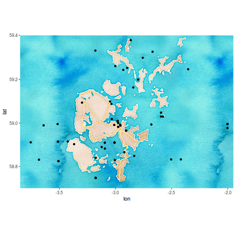
First of all let’s plot the spatial coordinates of the aircraft crash sites against a nice background. I created a rectangle location based on the bounding box of aircraftShp:
We can use ggmap to download the background:
[generic linenumbers=”False”]
library(ggplot2)
library(ggmap)
bgMap <- get_map(location=location, source="stamen", maptype="watercolor")
ggmap(bgMap) + geom_point(data=aircraft, aes(x=coords.x1, y=coords.x2))
[/generic]
Aircraft crash sites around Scapa Flow
Exploring other dimensions
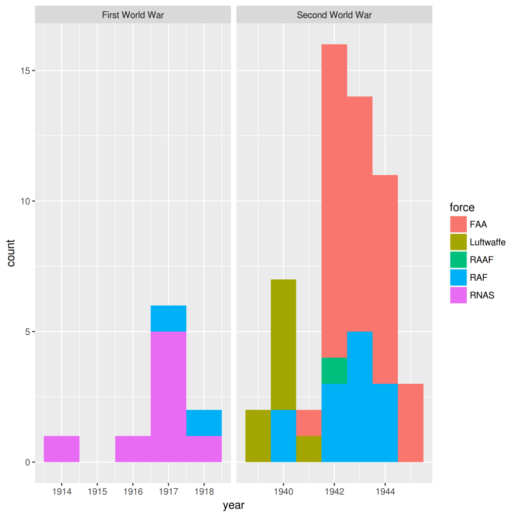
This is ok but it is something we can already do with any GIS so…what’s the deal? The thing is that aircraft is an R Data Frame so we can plot any variable using a graphic library, something that R does way better than any GIS. For example, let’s take a look at the temporal dimension:
[generic linenumbers=”False”]
ggplot(aircraft, aes(x=year, fill=force)) + geom_histogram(binwidth=1) + facet_wrap(~war, scales=”free_x”)
[/generic]
Losses by force and year
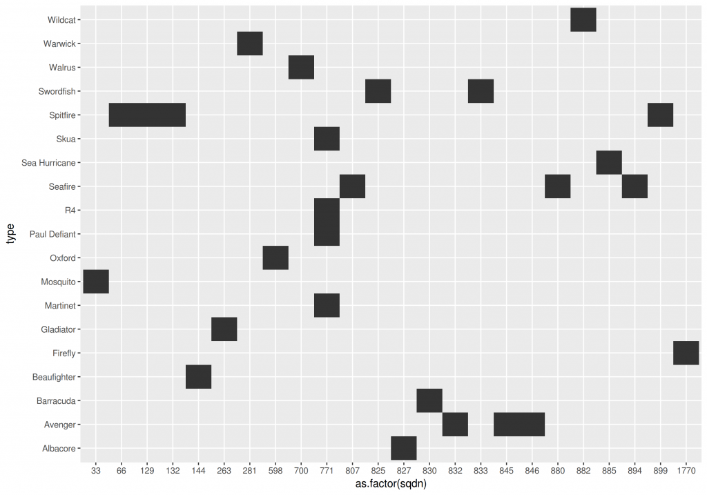
We can also create a table of planes used by the different British squadrons that suffered losses:
And we can then combine the 3 plots into a nice visualization:
[generic linenumbers=”False”]
library(gridExtra)
grid.arrange(arrangeGrob(arrangeGrob(g1,g2, heights=c(2/3,1/3), ncol=1), g3, widths=c(2/3, 1/3), ncol=2))
[/generic]
Aicraft Losses in Orkney islands during the two World Wars
Interpretation
These visualizations allow us to identify several interesting things going on:
The Second World War had way more accidents than the First one.
It would seem that Luftwaffe stopped flying over Scapa Flow after the first years of WW2
The Fleet Air Arm had a very large increase on losses after 1941.
Most squadrons only flew 1 type of plane being the exception the 771 Naval Air Squadron. It makes total sense given the diversity of missions flown by this squadron.
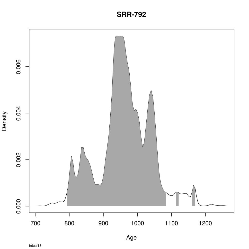
C14 sampling is the most popular technique that archaeologists use to estimate absolute dates of sites. The method uses an organic sample to measure radiocarbon age that finally needs to be calibrated to calendar years (see the Wikipedia entry for details).
I have always been puzzled that C14 samples are typically calibrated using specialized proprietary software. I don’t usually work with C14 but I was curious to see if you can calibrate samples using R (the language I used for everyday statistical stuff). The answer is that someone already created a package for this (surprise, surprise). It is called bchron and was developed by Andrew Parnell.
You will need a data frame with at least 2 columns: a) age and b) standard deviation. I used data from the amazing Maes Howe cairn in Orkney islands collected from the Scottish Radiocarbon Database in Canmore.
Bchron provides a function called BchronCalibrate receiving 4 parameters:
age
deviation
curve
sample Id optional
You can calibrate a single date:
[generic linenumbers="False"]
singleResult <- BchronCalibrate(3765, 70, "intcal13", "Q-1481")
plot(singleResult)
[/generic]
The cool thing here is that you can also pass a list of values to each parameter instead of a single value. If you do this then you will calibrate all dates at the same time:
As you can see in this code block we are pass the columns age and ageSd as the first 2 parameters. The third parameter is a list of "intcal13" as long as our sample size (so you are saying that each sample will be calibrated using the "intcal13" curve). We use the column labId as the last argument to help us identify each sample.
So…that's it! You can cycle through the calibrated samples with:
[generic linenumbers="False"]
plot(results,pause=T)
[/generic]
You can also export the calibrated samples to a pdf document:
[generic linenumbers=”False”]
pdf(“calibrated.pdf”)
plot(results)
dev.off()
[/generic]